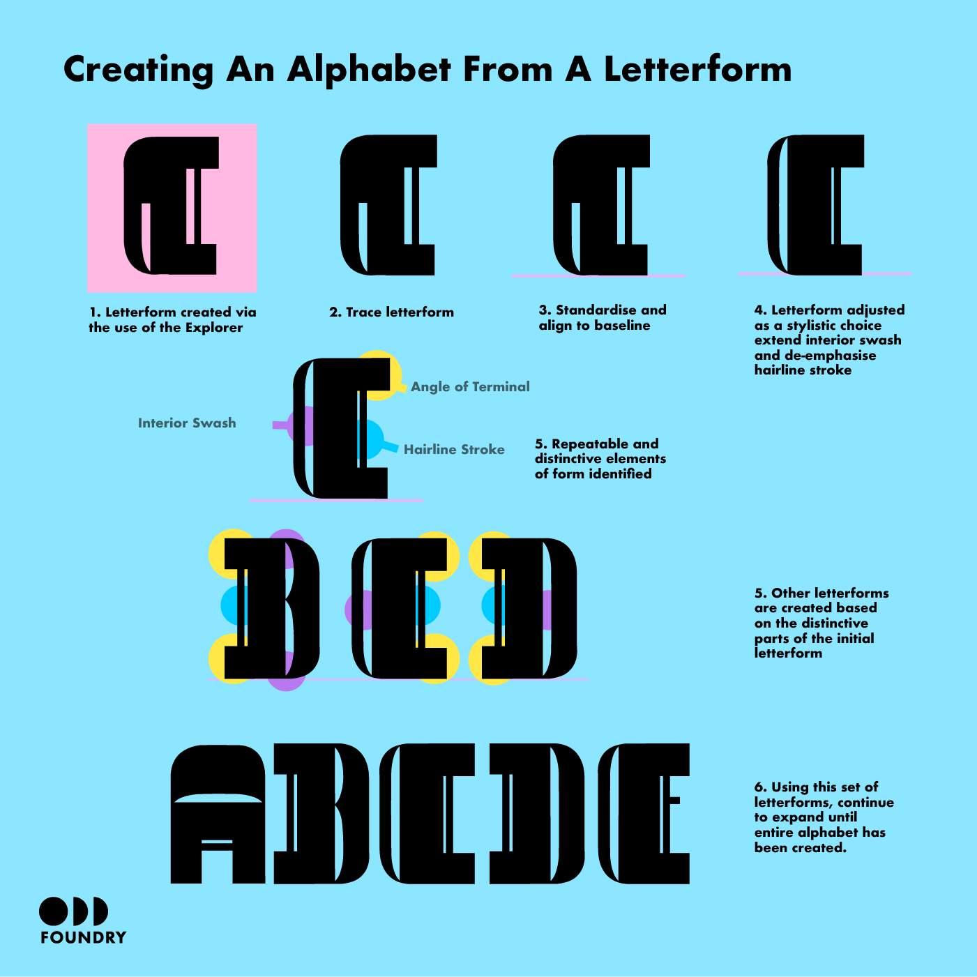
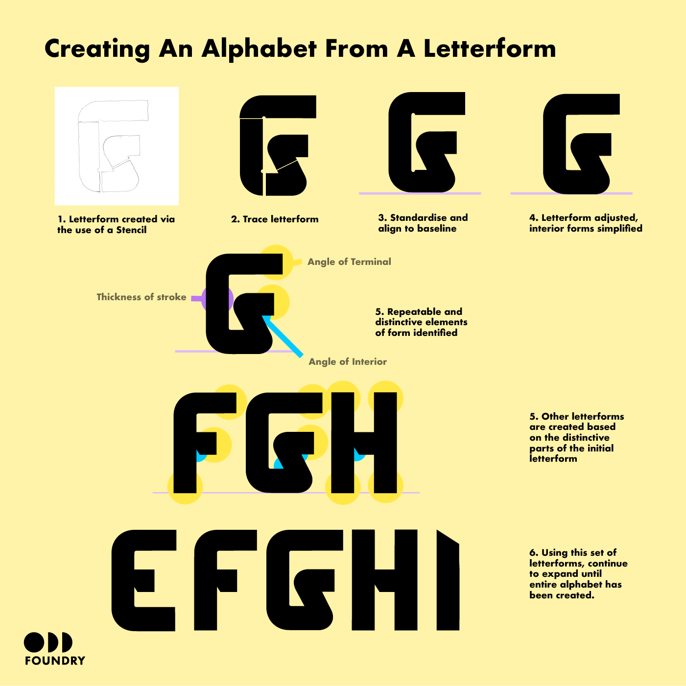
The components that the tools on this site use are all constructed to relate to each other in terms of size and possibilities for alignment. Each tool is created in a way that allows the user to play and experiment with forms, but it is up to the user to then decide when they have created a form that is recognisable as a letter. This letterform can be worked on in a software of the users choice, such as Illustrator.
Once they have created that form they are encouraged to reflect on its shape. What are the defining features that make your form distinct as a letter and what are the defining characteristics that can be applied to a typeface as a whole to create a distinct collection of unified letters? Are there repeated angles or interesting ways that strokes intersect? Is variation in the thickness of the strokes or are they uniform across the whole letter? Are there serifs or terminals that end in interesting ways? The user may find that elements that create interesting letters will be distracting when applied to a whole alphabet so an element of refining in needed along the way as a full alphabet is constructed.
As these characteristics are identified they can be applied to different letters of the alphabet. The user may find it helpful to create visually similar letters in groups, such as “d, p, d, q”, “E, F or “m,n,u”. As you approach a full alphabet, test the comprehension of the shapes as letters both by viewing them as single letters and also as words.
Once an entire alphabet has been created, consider how the alphabet will be spaced. Are the letterforms compact? Will they suit tight letter spacing? Or are the forms airy and elegant, suiting a more generous letter spacing.


